Clickstream analytics: creating a user interaction heat map for an e-commerce website
See Quix Streams in action by vizualizing mouse movement patterns in real-time using hopping windows. A Python data streaming tutorial for web analytics.

Our library is open source—support the project by starring the repo.
Your website produces content every hour and you want to respond dynamically, perhaps with tailored offers and targeted advertising, perhaps by emphasizing popular content and removing unpopular content.
With all of these cases you need a user interaction heat map, and the optimal solution is built using a stream processing pipeline. You could use a third-party solution such as HotJar, but then your data will be stored in a database and queried afterwards, which creates latency unacceptable for your use case. Similarly, if you’re processing large quantities of data, you’ll face high costs from your vendor.
In sum, you’ll be relying on batch processing when your use-case requires stream processing. In this tutorial you will see how the Quix Streams library enables you to work dynamically with your live data while reducing both costs and latency.
After setting up this project within your Quix account you’ll have access to the Python files within this application. By forking the repo, you’ll be able to play around with the project and even use it as a template for your own clickstream analysis.
Revealing the cursors
The pipeline we’re going to create collects data from a fictional e-commerce web page and aggregates all users' mouse coordinates to produce a heat map. The coordinates are gathered four times a second. The heatmap is then overlaid on the original site which provides a visualization of the 'hottest' areas on each page.
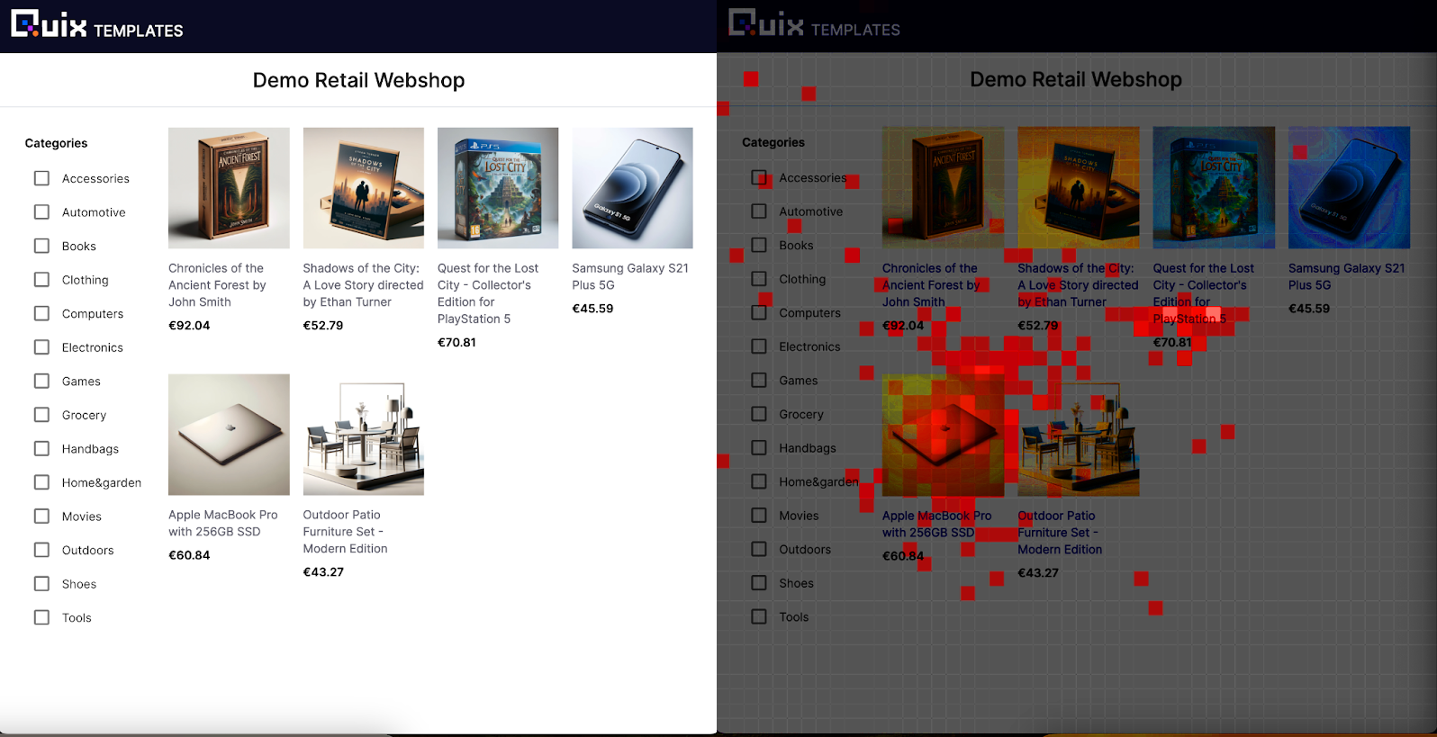
Here we see the heat map in action. Now we’re able to glean insights. These customers were initially interested in the Playstation 5 game before realizing that the MacBook is being sold for $60.84!
Let’s see how this is built.
What you’re going to need
- A GitHub account
- A Quix account (which you can sign up for here and receive $300 free credit)
What you’re going to learn
- How to string together applications through topics
- The
.updateand.to_topicmethods within Quix Streams - How to re-key a topic
- How to aggregate a value
- The concept of a hopping window
- The
.hopping_window,.reduceand.finalmethods
Getting it up and running
To get you set up and ready to go, follow this blog:
Key Code Segments
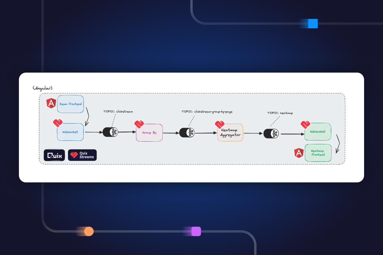
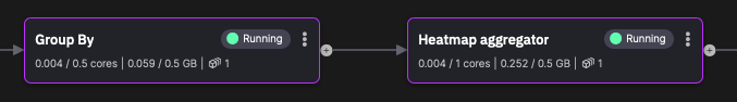
Once set up is complete you'll be able to see the pipeline for the "Clickstream analytics heat map" project:
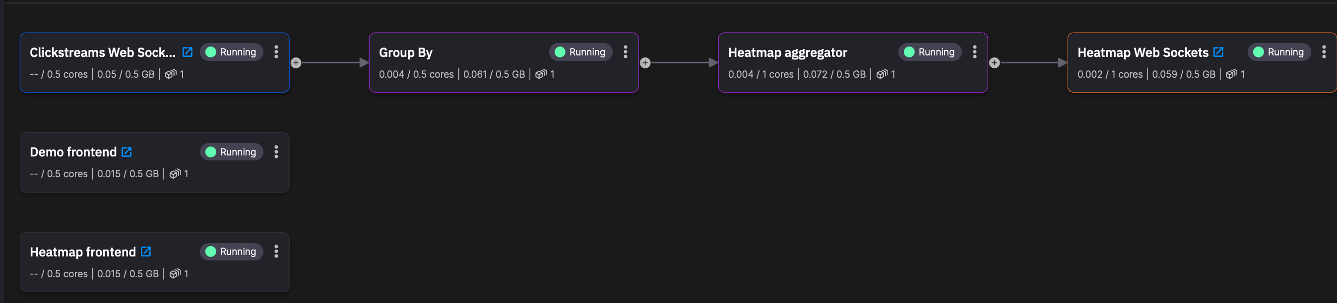
In summary, the Demo Frontend is where the mouse information is generated. Through the Clickstreams Web Sockets the data enters the pipeline. The mouse information is then grouped by webpage (Group By). Heatmap aggregator splits the main webpage into fifty tiles and then counts the number of times any customer’s mouse has appeared in each tile, within the past five minutes. That data, through the Heatmap Web Sockets, is then sent to Heatmap frontend which, you guessed it, displays a heat map over a webpage, that webpage being identical to Demo frontend.
With that understanding in place we can now dig deeper and look at key code segments.
Demo Frontend - Clickstream Web Sockets
In order to see the code for Demo frontend click on the application:
Then click on ‘Edit code’
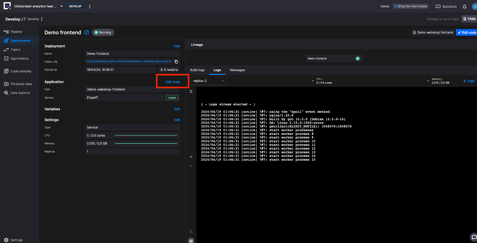
The mouse coordinates are gathered on the UI via the tracking.js file (found at src//tracking.js.). Within that file the payload variable defines the properties of the JSON schema. Properties which are relevant downstream include: the "session_id", "the page_url", the window dictionary: {“width” and “height”}, and the mouse-coordinates dictionary: {“x” and “y”}.
const payload = {
	"session_id": session_id,
	"type": event.type,
	"page_url":  window.location.href,
	"relative_path" : window.location.pathname,
	"query_prams" : window.location.search,
	"buttons": event.buttons,
	"window": {
		"width": document.documentElement.scrollWidth,
		"height": document.documentElement.scrollHeight,
	},
	"mouse-coordinates": {
		"x": event.clientX,
		"y": event.clientY
	}
}
This JSON is sent via the Clickstreams Web Sockets to the “clickstream” output topic.
If you haven’t already, open the Demo frontend and move your mouse around the web page. This will generate a message similar to this:
"session_id": "e85441d6-b2ae-4d83-b759-14486aafb5b9",
"type": "mousemove",
"page_url": "https://webshop-demo-clickstreamanalytics-develop.demo.quix.io/",
"relative_path": "/",
"query_prams": "",
"buttons": 0,
"window": {
	"width": 1710,
	"height": 870
},
"mouse-coordinates": {
	"x": 1175,
	"y": 1
}
In order to see messages like this, navigate to the Topics tab within the navigation bar on the left hand side of the screen.
Click on the “clickstream” topic and once on that page set the offset to “newest” in order to see your messages:
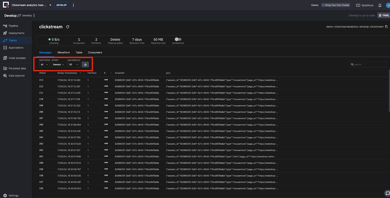
(Switching the offset to “Live Messages” is a great way to see the data in motion if you head back to the Frontend web page and move your mouse)
Group By
As it stands the data stream contains all mouse movements from the home page and from the individual product pages. A user interaction heat map using this data would provide no insights.
The Group By application allows us to repartition the stream using each page’s URL. It allows each web page in the heat map frontend to receive only relevant data from the client-facing website.
Let’s look at the code.
import os
from quixstreams import Application
from dotenv import load_dotenv
load_dotenv()


app = Application.Quix("group-by-v1", auto_offset_reset="earliest")


input_topic = app.topic(os.environ["input"])
output_topic = app.topic(os.environ["output"])


sdf = app.dataframe(input_topic)


sdf = sdf.update(lambda row: print(row))


sdf = sdf.to_topic(output_topic, key=lambda key: key["relative_path"])


if __name__ == "__main__":
   app.run(sdf)
From the Quix Streams library we import the Applications module. This module provides methods and classes which together give you immediate access to your data in Kafka alongside simplified functionality for working with your data in real time.
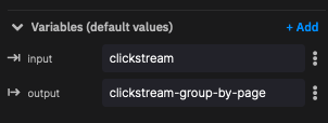
The input and output topics are defined within Quix Platform:
The sdf (streaming dataframe) is a class within the Applicationsmodule. It allows us to interact with the messages within the clickstream input topic. You can read more about the streaming dataframe here.
The sdf.update method runs code on each row in the dataframe/ message in the Kafka topic. This line prints every row for debugging purposes.
With the debugging in place, the sdf.to_topic method sends the messages to the predefined output topic. The "key" argument applies a lambda function which alters each message’s key, previously set by the “session_id”, but now set by the message’s “relative_path” property.
To see this, go to the Topics tab and switch between "clickstream" and "clickstream-group-by-page". Notice how the streamID has changed.
We run the application with the app.run() method. The streaming dataframe is passed to the method which will then execute the previous .update and .to_topic method for every message arriving from the clickstream topic.
Heatmap aggregator - Grid and Dictionary
The Group By and Heatmap aggregator are connected by the "clickstream-group-by-page topic".
What we will focus on within Heatmap aggregator is, first, how it updates the heat map grid statefully through a dictionary. Second, we will see how it defines the time period in which data is gathered for the heat map, namely through a hopping window.
Let’s start with a sample output from Heatmap aggregator:
 "value": {
   "3": {
     "2": 1
   },
   "5": {
     "4": 3
Those numbers are locations on the 50x50 grid map. Below is a 5x5 ASCII grid:
1 2 3 4 5
+---+---+---+---+---+
1 | | | | | |
+---+---+---+---+---
2 | | | 1 | | |
+---+---+---+---+---+
3 | | | | | |
+---+---+---+---+---+
4 | | | | | 3 |
+---+---+---+---+---+
5 | | | | | |
+---+---+---+---+---+
With the value "3": { “2”: 1:}
- 3 is on the x axis
- 2 is on the y axis
- 1 mouse was at that location on a user’s browser
It is illuminating to rewrite the second example like so: [3, (5, 4)] – there are 3 cursors hovering over the location (5,4).
Heatmap aggregator - Hopping Window
Your website is constantly producing data. How do you set your processing to give you the last five minutes worth of data as often as you need without constantly querying a database?
This is where windowing comes in. Windowing allows you to include/ exclude messages from your data stream according to their timestamp.
Within this pipeline we use a hopping window. Hopping windows slice time into overlapping intervals of a fixed size and with a fixed step.
Say that the fixed size and the fixed step are both five minutes. That would create these two windows:
00:00 - 00:05 (window 1)
00:05 - 00:10 (window 2)
If the mouse coordinates [3, (5, 4)] arrive at 00:02 they will fall within window 1. If they arrive at 00:07 they will fall within window 2.
Our hopping window takes steps every 0.25 seconds; every 0.25 seconds a new window is created. Our windows look more similar to this:
00:10:00 - 00:15:00 (window 3)
00:10:25 - 00:15:25 (window 4)
Note - if our coordinates arrive at 00:07 then they will register in both window 3 and window 4. What this means within the context of our heatmap is this – when a grid becomes colored it will stay colored for five minutes. Those coordinates will register in every window for the next five minutes.
It is complex creating a hopping window with client libraries such as kafka-python, but this complexity is stripped away in the Quix Streams library, as we will now see.
Let’s begin with the line with Heatmap Aggregator which filters messages for mouse movement (we do not want to know where inactive cursors are sitting on the page):
sdf = sdf[sdf["type"] == "mousemove"]
We calculate relative coordinates based on the size of the page. These values range from 0-1 where 0 = 0% of the height/width, 0.5 = 50% and 1 = 100%. These become new columns in the dataframe.
sdf["x-relative"] = sdf["mouse-coordinates"]["x"] / sdf["window"]["width"]
sdf["y-relative"] = sdf["mouse-coordinates"]["y"] / sdf["window"]["height"]
Next we transform the float generated above into a tile on the grid, which will then sit within a ["tile-coordinates"] column.
sdf["tile-coordinates"] = sdf.apply(lambda row: {
    "x": math.floor(tile_grid_size * row["x-relative"]),
    "y": math.floor(tile_grid_size * row["y-relative"])
})
We create a hopping window using the .hopping_window method, one which moves every 0.25 seconds and holds events from the past five minutes.
.hopping_window(timedelta(minutes=5), 250) \
The reduce method performs two functions. This method calls the heatmap function which aggregates the mouse movements for a given tile. The reduce method itself takes a dictionary argument. This dictionary persists through the entire window and the heatmap() function is called on every row, updating the dictionary. The method is named ‘reduce’ as it reduces the window data down into this dictionary, and this dictionary represents the heat map grid.
.reduce(heatmap, lambda row: heatmap({}, row))\
The .final method configures the window to only output the data when the window has closed. The state of the dictionary halfway through the window does not concern us. We only want output after five minutes have elapsed.
.final()
At the end a column is added containing the grid size. This is for the sake of the downstream consumer which can then render a grid of the correct size.
sdf["grid-size"] = tile_grid_size
For every window, the output of the window is published to the topic:
sdf = sdf.to_topic(output_topic)
ClickStreams Websocket
We can now return to the sample data from before:
"value": {
	"3": {
		"2": 1
	},
	"5": {
		"4": 3
Recall that the key for each message is its URL. In other words, different grids will arrive indexed by their webpage (e.g, homepage, Macbook, PlayStation game).
The websocket exposes the topic on different broadcast groups, one for each path on the website. When you open the heat map frontend on the homepage, or on a product page, you will make a call to the websocket and receive the dictionary representing the heat map grid.
Heat map Frontend
The heatmap has its own tracking.js file (found at the same path within that application). That file creates the grid. The tiles are colored relative to the most popular grid tile. If the greatest number of cursors is three, and four tiles contain that many cursors, then those four tiles will all be the same shade of pink. Alternatively, if you had one tile with ten cursors in it, and the rest had five or under, that one tile will have a far more intense color. Playing with the demo you have just created will perfectly illustrate this.
Now you know the key components of the Clickstream Analysis Heat Map application! Through the Quix library you have seen how key components of stream processing such as: producing to a topic, grouping, aggregating, and windowing can all be achieved with methods from the Application module. We encourage you to play around with the application, to co-opt it for your use case, and to let us know what incredible things you achieve with it and with Quix Streams more broadly.
To get in touch join the Quix community Slack. This is also where you can go if you need help with any part of the tutorial.
- To learn more Quix Streams, check out the relevant section in the Quix documentation.
- To check out more of our tutorials head here.
What’s a Rich Text element?
The rich text element allows you to create and format headings, paragraphs, blockquotes, images, and video all in one place instead of having to add and format them individually. Just double-click and easily create content.
Static and dynamic content editing
A rich text element can be used with static or dynamic content. For static content, just drop it into any page and begin editing. For dynamic content, add a rich text field to any collection and then connect a rich text element to that field in the settings panel. Voila!
How to customize formatting for each rich text
Headings, paragraphs, blockquotes, figures, images, and figure captions can all be styled after a class is added to the rich text element using the "When inside of" nested selector system.

Check out the repo
Our Python client library is open source, and brings DataFrames and the Python ecosystem to stream processing.

Jack Murphy is a Developer Educator at Quix where he writes educational content through which he aims to inform and enthuse readers of all levels. In his role he draws upon years of pedagogy, philosophical writing and programming.
Related content
Clickstream analytics: creating a user interaction heat map for an e-commerce website
Continuously ingest documents into a vector store using Quix, Qdrant, and Apache Kafka

Get started in minutes with the Hello Quix template
