Behind the design
Twelve questions with Quix’s lead product designer and visual designer on integrating brand and product design.

Our library is open source—support the project by starring the repo.
Designing a brand or a product is no small effort. But all of the sweat and strategy falls away when you get it right: Brands look inspired. UX seems effortless. To quote our chief technology officer, Tomas Neubauer: “It just works.”
As a result, it’s easy to miss the subtle strategy. Because Quix’s small but mighty design team is fueled by user research and many rounds of trial and error, I thought it would be interesting to dive into the why behind what they create.
I asked Matt Lyver, Quix’s lead visual designer, and Almudena M. Castro, Quix’s lead product designer, to spill the tea on the design thinking behind Quix’s latest major product release and the brand.
Q: As an all-remote team, how does Quix work on complex projects like brand design and product experience?
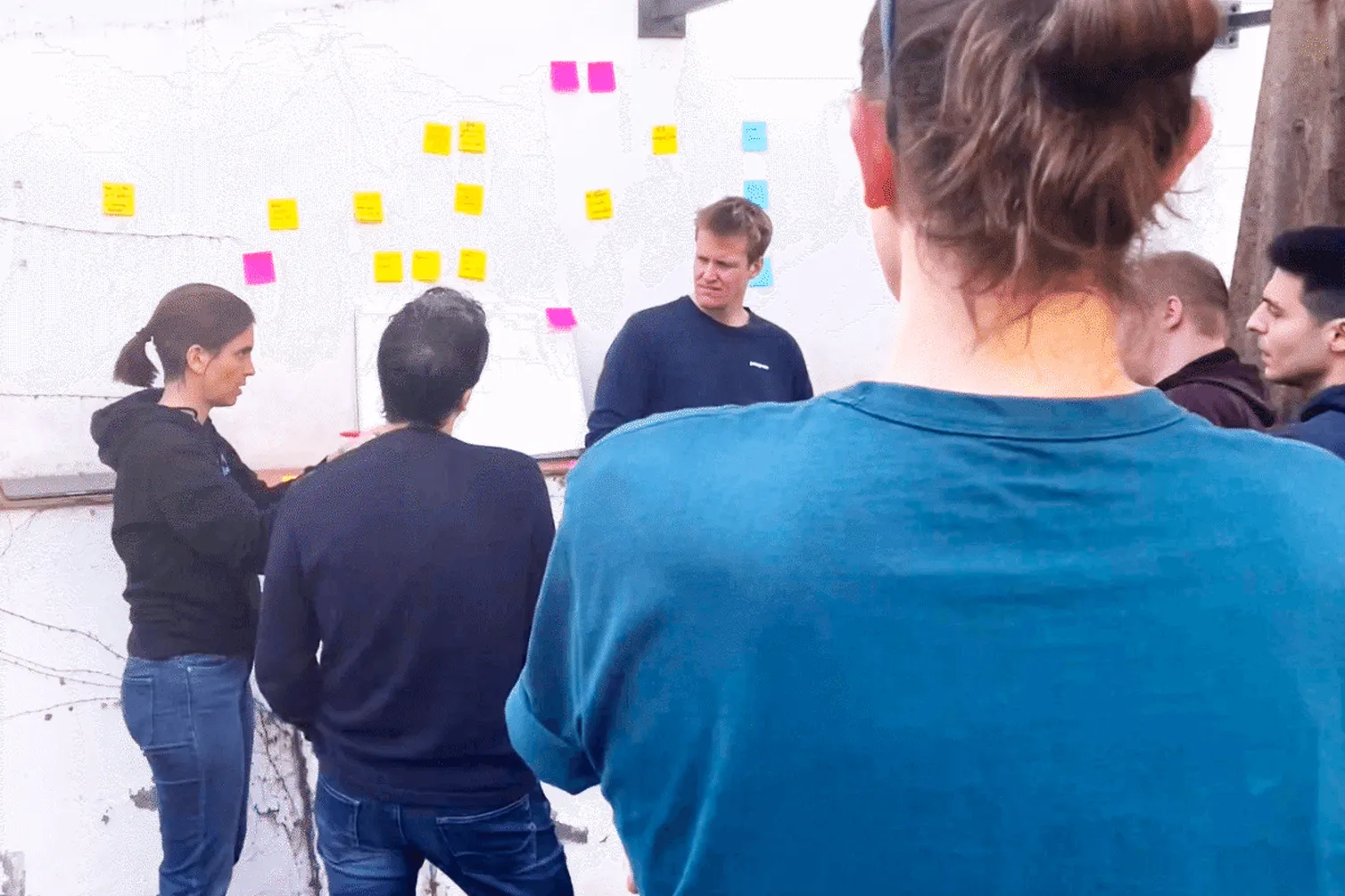
Matt: We kick off major projects with events we call “Quix starts.” We meet in a European city for a few days and focus on a specific goal. The outcome is deep alignment across the project’s goals, major benchmarks and hurdles, and a set of expectations. It basically gives you the freedom to go back to your corner of the world (we’re spread across more than a dozen cities) and buckle down to deliver.

Q: Take us back to the genesis of Quix’s latest product iteration. What happened?
Almu: I led a massive product road-mapping session in London last December. We wanted to clarify for users what they can build with Quix, and accelerate their time to value. The problem was that we previously anchored our product around Kafka concepts, like topics and partitions, but these were not always intuitive or helpful to our users. That gave us an opportunity to rethink the center of our product.
Q: How did you go about designing a solution?
Almu: I used a dashboard to help us visualize the user’s journey. We considered each problem users face, in the order they come up. We knew that helping users visualize how Quix works would make it easier to move through the user journey. This also makes the value of Quix more clear.
Q: What did you learn from your user research?
Almu: Users saw the value of Quix for workflow orchestration, helping them build data products and data pipelines, and having all the tools they need in one place. But Quix didn’t feel intuitive enough. They had to jump to different places within the product to access each tool, and they didn’t know where the tools lived or the sequence they’d need them. It’s like trying to cook in someone else’s kitchen.
Matt: Our research also showed that there were key concepts and terminology that got in the way of the user experience. Many of our users aren’t software engineers — they might be mechanical engineers or data scientists or physicists — so while Python is very comfortable for them, Kafka isn’t. So anchoring Quix to Kafka didn’t make sense. Our goal was to reduce friction as much as possible.
Q: What was the business opportunity you identified?
Matt: We want to provide a visual representation to help people understand what they are building. There’s so much more than Kafka necessary for stream processing — we are unifying at least eight different complex technologies to make stream processing easy. So it was both a design and an engineering effort: we needed to take a disconnected workflow that required you to jump from one part of the left navigation to the next, and turn that into a unified product experience that was dead simple to use. We called it the pipeline view.
Q: How did you develop a visual and verbal model of Quix?
Almu: Verbally, we were inconsistent with the language we used. That’s normal for a new industry like stream processing, where no one really agrees on terminology yet. We had “stream – develop – deploy” and “read – model – write” and “ingest – model – deploy.”
Finally, we settled on “sources – transformations – destinations.” I think that covers the user’s goals really well: they need to ingest data from a source, work with it to transform or analyze data, and then send the data and the output of their analysis to a destination, like a data warehouse, an alerting system, or even back to the product itself. We want users to be able to build a data pipeline in minutes, not months.
Q: Some of the design choices make more sense with context. How did the Quix brand come about?
Matt: I’ve been with Quix virtually from the start. Since the founders first worked together on McLaren’s Formula 1 team, we wanted to nod to that racing heritage with the electric blue and orange colorway of the McLaren race car.
The concept was to show the dynamic energy of data transformation: our customers’ streaming data is transformed through Quix and delivered to products and applications. I knew a gradient from blue to orange made sense as a visual metaphor for this velocity and movement. However, when creating the gradient, the intersection was dull and muddy. Adding in the vibrant purple solved that problem. So now the gradient moves from blue to purple to orange, representing the transformation that Quix makes possible.
Q: How does this color aesthetic translate into product usability?
Almu: We’re using each of the three colors for the three steps in the Quix model. Blue represents sources, such as our customer data. Purple stands for data transformations. Orange is the destination, where users send their processed data. We’ve used this across our pipeline view and to color-code the library of connectors and code snippets. Users can build data pipelines and products with our library, using little or no added code.

Q: What else does the design communicate about the product?
Matt: For a little while, the gradient only lived conceptually on the marketing site. But then we took the opportunity to translate this into the product itself. The color transformation makes it very easy to visually distinguish the three stages in a data pipeline.
One of our core values is being people-first, so we also wanted the design and the Quix brand to feel friendly and approachable. For most companies, stream processing is incredibly difficult or out of reach. But Quix makes it easy, even for people who aren’t software engineers by training. So we didn’t want the product to look like a legacy tool. It had to look modern, because at the end of the day, we’re building a modern data tool that has never existed before.
Q: Where did you feel you could push the design envelope?
Matt: When you have lots of input from stakeholders on design, you run the risk of a design-by-committee that generates something kind of beige and forgettable. We wanted to be brave, and challenge convention. That meant we couldn’t just design based on personal aesthetics. There’s a place for things that aren’t the norm.
For example, developers aren’t used to seeing more than one typeface in their day-to-day software. The argument against it is, “Usability might be affected if there are multiple type styles.” But because we’re building something entirely new, we’re in a position to challenge that, as long as usability leads our decisions. So we kept a highly legible body font throughout the product, and spiced it up with a slightly more stylized font for headings. It’s a way to carry the brand details through the product and we haven’t had any negative feedback from users.
Q: How about pushing the envelope on the product itself?
Almu: As long as you put users first, you can make audacious choices. When you’re creating something new, there’s no convention to fall back on — you need to think differently. As a small company, we’re in the position to invent and iterate quickly.
A big company might have taken six months to build a pipeline view, but at Quix it took one month. That included getting it in front of users for validation and testing, and to challenge our hypotheses. Then we immediately used this rapid testing and iteration to inform our approach, so we weren’t flying blind on our assumptions.
Q: What’s next on the design front for Quix?
Almu: The user testing also helped us map requirements for future iterations and requests to develop a “lineage view” in the deployment detail. So our next step is improving the pipeline view, from our MLP (our minimum loveable product), to help users grasp the bigger view of what a data pipeline can be. We don’t have a full architectural diagram yet, so a new version could be a visual builder: as the user adds pieces, they can see the full pipeline — not just the branch, but the whole tree.
What’s a Rich Text element?
The rich text element allows you to create and format headings, paragraphs, blockquotes, images, and video all in one place instead of having to add and format them individually. Just double-click and easily create content.
Static and dynamic content editing
A rich text element can be used with static or dynamic content. For static content, just drop it into any page and begin editing. For dynamic content, add a rich text field to any collection and then connect a rich text element to that field in the settings panel. Voila!
How to customize formatting for each rich text
Headings, paragraphs, blockquotes, figures, images, and figure captions can all be styled after a class is added to the rich text element using the "When inside of" nested selector system.

Check out the repo
Our Python client library is open source, and brings DataFrames and the Python ecosystem to stream processing.

Dr. Kiersten Thamm works as the Head of Technical Content at Quix. She directs the technical content strategy across the company by planning, writing and editing dev docs, tutorials and conference presentations. She also manages projects for the developer relations team and helps grow the Quix technical community.
Related content

Navigating stateful stream processing

A guide to windowing in stream processing

.jpg)
What is real-time feature engineering?
